The power of color in marketing can mean the difference between an indelible brand and one that’s quickly forgotten. Indeed, colors play a key role in branding, allowing you to connect with your customers both visually and emotionally before a single word is said. Ensuring accurate color representation throughout your marketing efforts is crucial to telling your brand’s story.
What is Color Matching?
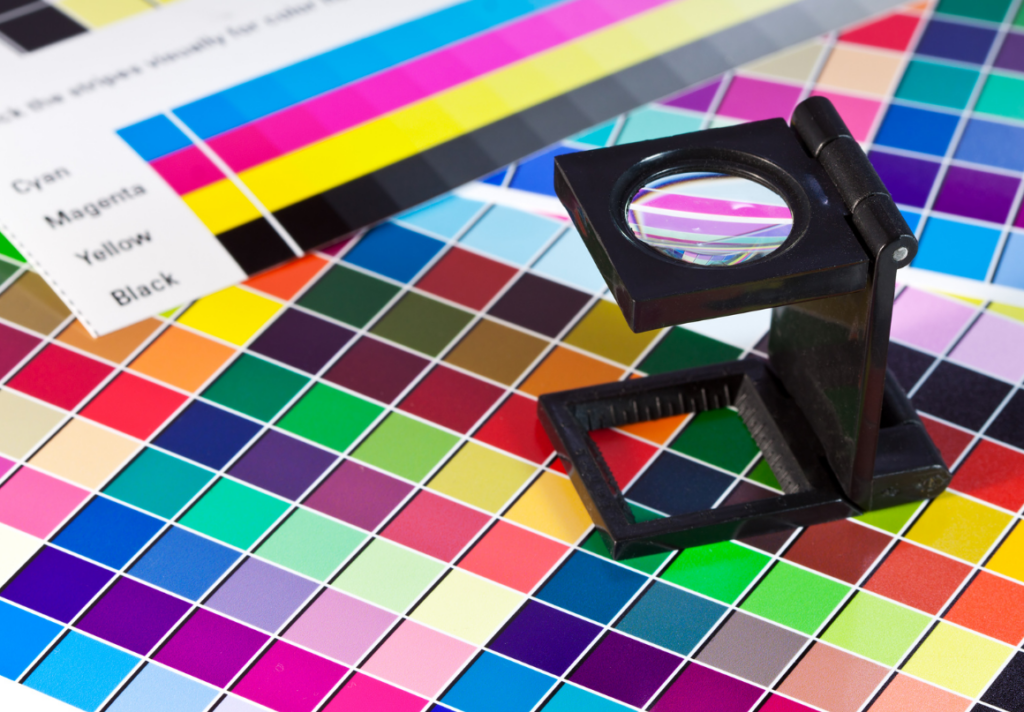
Put simply, color matching is the process of assuring that a color in one medium remains consistent when converted to another medium. The task increases in difficulty as different media use different color models.
From RGB and CMYK to Pantone, it is important to know the difference between models when choosing colors. Understanding the difference between the predominant types – RGB, CMYK, and Pantone – will save you time and give you top-quality color for your specific project.
What do RGB and CMYK mean?
RGB-In digital marketing, one of the most important and recognizable systems for measuring and describing color is the RGB color model. The model uses three primary colors: red, green, and blue, which form all other colors. The RGB model is best used for digital text and images, and the majority of the digital images you see on your computer screen and smartphone are produced using these shades.
In the RGB model, colors are added together to create lighter colors in what is referred to as a light additive color model. Because your laptop, desktop and smartphone screens are black, light is added to generate color. If all three colors are used at 100 percent, the screen will appear white, but in different combinations different colors will result.
CMYK-While the RGB color model is best for digital text and images, the CMYK color model is best for color printing on paper. Most printers use CMYK ink to print text and images through a series of dots that give the impression of a solid color. The CMYK color model is subtractive, meaning ink colors are removed to get lighter colors. The four ink colors Cyan, Magenta, Yellow and Black are padded or layered to achieve the desired color; to get lighter hues of color, ink is removed.
The type of media you select will determine which model is best to use. RGB is used for designing online marketing materials and CMYK is best for printed materials. But how do you get consistency when using both?
For Color Consistency, Use the Pantone Color Model.
A widely used tool to preserve consistency in both digital and print marketing, the Pantone Matching System (PMS) creates colors that are utilized as a baseline for myriad applications across advertising, design and manufacturing. There are 1,114 different colors in the Pantone Matching System and each is identified by a number and a name.
Choosing your brand colors is critical to the identity of the business. The colors you select create associations and mental images, inspiring design elements, product development, and capturing your target audience’s attention. But keeping the same color consistent can present challenges. The Pantone Matching System can preserve color consistency by reducing color interpretation, verifying colors across multiple mediums before production, and ensuring multiple production runs all match perfectly.
Brand Consistency Is Important.
In addition to color consistency, it is important to establish overall brand consistency in your marketing strategy. Creating brand guidelines will help to ensure cohesion in all marketing activities. Sometimes referred to as a brand style guide, this tool should lay out all the visual details of your brand including:
- Logos
- Font styles and sizes
- Color palette
- Images and artwork
- Examples of company voice and tone (how the brand uses language and emotion)
The brand guidelines are an instruction guide or rule book of what to do – and what not to do – when communicating your brand. Primary and secondary colors are always listed, and details and specific scenarios for each category are included. Finally, brand style guides should look professional, as they are a direct reflection of the brand.
Every Detail Counts.
Consistency is critical if you want your brand to stand out in consumers’ minds. Let Lucky Tamm Digital Marketing help. From choosing the appropriate color model to uniformity in the shades of color chosen for the brand, LuckyTamm Digital Marketing knows every detail counts.
